Investment hypotheticals are imaginary scenarios of portfolio returns. They are summaries of theoretical past or future circumstances that can serve as powerful tools for instruction. We think they can be particularly effective when the goal is as much to convey how investment math works as it is to convey the results of that math. We think discussions covering what-ifs can be truly impactful when helping folks think through the arithmetic of retirement planning. To provide a basis for such conversations, this month’s commentary reviews:
- The importance of savings during the “accumulation” phase of investment
- The impact of various rates of withdrawals during the savings “decumulation” phase
- How adding flexibility to investments may help retirees remain invested during periods of market stress
- The concept of an investment glidepath that addresses the tendency to become more risk averse as one ages
Product of Patience
How much money we will have in retirement? Honestly, unless you’re quite close to your last day of work, it’s impossible to know. Still, we can estimate what a long-in-the-future retirement might look like using some relatively straightforward math. We start with savings, the basic building block of a retirement spending plan. The more we can save throughout our working years, the greater the pool of funds from which to spend during retirement. Except, a dollar we save now likely won’t buy the same amount of goods or services in the future. This diminishing value reflects the impact of inflation. To combat that inflation, we can choose to invest our savings over time, with a minimal goal perhaps being to generate a return on those investments equal to inflation. Such a bare-minimum approach may help ensure that our savings retain their original value.
Seeking only to have a dollar we save now be able to buy us the same amount of stuff in the future is a goal well on the “conservative” side of the investment spectrum. That is, because our expectations for return are relatively low, we probably can implement a strategy to achieve that goal with little risk of failure. In fact, the U.S. Government offers securities that are considered risk free and do this very thing.
We might want to shift our expectations a little higher, though. We could seek to invest our savings so that they might be worth more in the future than they are now. Achievement of that goal, however, mostly requires that we take on additional risk in our investments. And by risk, we mean adding a more meaningful level of uncertainty to the outcome of our investment approach.
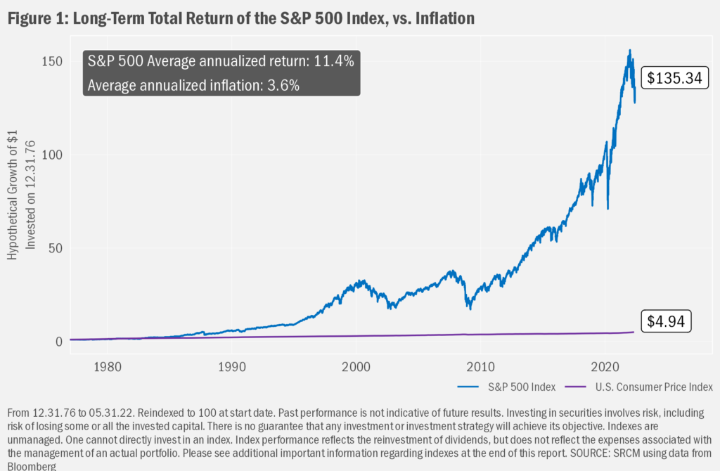
To begin our review of investment return and risk we’ll start with some simple math. We find it helps to see investing as a series of multiplications. Take a starting value of $1 and multiply the subsequent investment returns to see how that portfolio grows. For example, if at the end of 1976 you started investing in U.S. stocks, as represented by the S&P 500, you’d have a bit more than $135 at the end of last month, reflecting an average annualized total return of 11.4%. That sum compares very well to inflation, which averaged 3.6% over that same timeframe, meaning one would need about $5 today for every $1 saved in 1976 to be able to enjoy the same spending power now as one had back then.
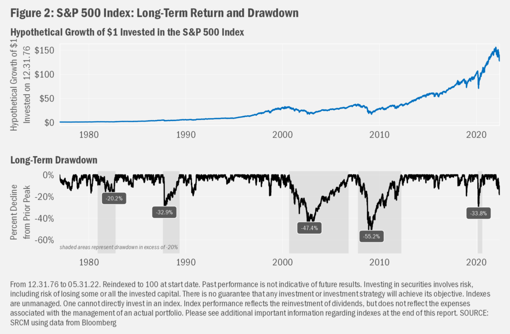
But though the inflation was very real, the investment side of that history is all hypothetical. For starters, it was not easy to replicate the S&P 500 way back then and you certainly could not have done so with only one dollar. Even more, since “total return” calculations include the effects of dividends, you’d have been required to reinvest all the dividends you received. Oh...and turning to the risk side of the risk and return equation, you’d have had to have remained fully invested over the whole timeframe, even during those periods when owning stocks might not have been so comfortable. In achieving the long-term annualized total return of 11.4% since 1976, followers of the S&P 500 have seen 5 periods during which the index saw drawdowns, or declines from a prior peak, of more than 20%. Hard to know if those declines might have prompted you to cut your losses and run from the market.
What’s Your Long-Term?
There’s an additional complication to the math: the long-term average of stock returns is unlikely to be that which any individual investor achieves. First off, an average is just that. The return of any individual year never exactly matches that average, and the range of returns across years has been very wide. Further, we all have different “investment time horizons”, meaning the time that we have our savings invested. For most, that’s not all 45-plus years since 1976 we showed in charts so far. In fact, each of us will have an investment time horizon specific to our particular employment, savings and retirement scenarios. We might even have multiple investment time horizons when we have differing goals, such as saving for a house or college. And those details matter greatly when we look to see how different investment time horizons historically might have resulted in different investment outcomes.
To see what we mean, let’s assume an individual only started meaningfully investing later in their careers, say around 40 years old with about a quarter century still on the clock before retirement. The 45+ years since 1976 can be broken up into many more 25-year periods. There are twenty such periods, to be exact, if we consider whole years since December 31, 1976 (e.g., starting in December 1975 and ending in December 2000; starting in December 1976 and ending in December 2001; and so on...). We get even more hypothetical time horizons if we choose starting points at each month instead of only December of each year (e.g., starting in December 1976 and ending in December 2001; starting in January 1977 and ending in January 2002; and so on...). What we find when we review all those potential 25-year periods is that the eventual outcomes varied widely. And that wide variation in results is reflective of the risks inherent to investing.
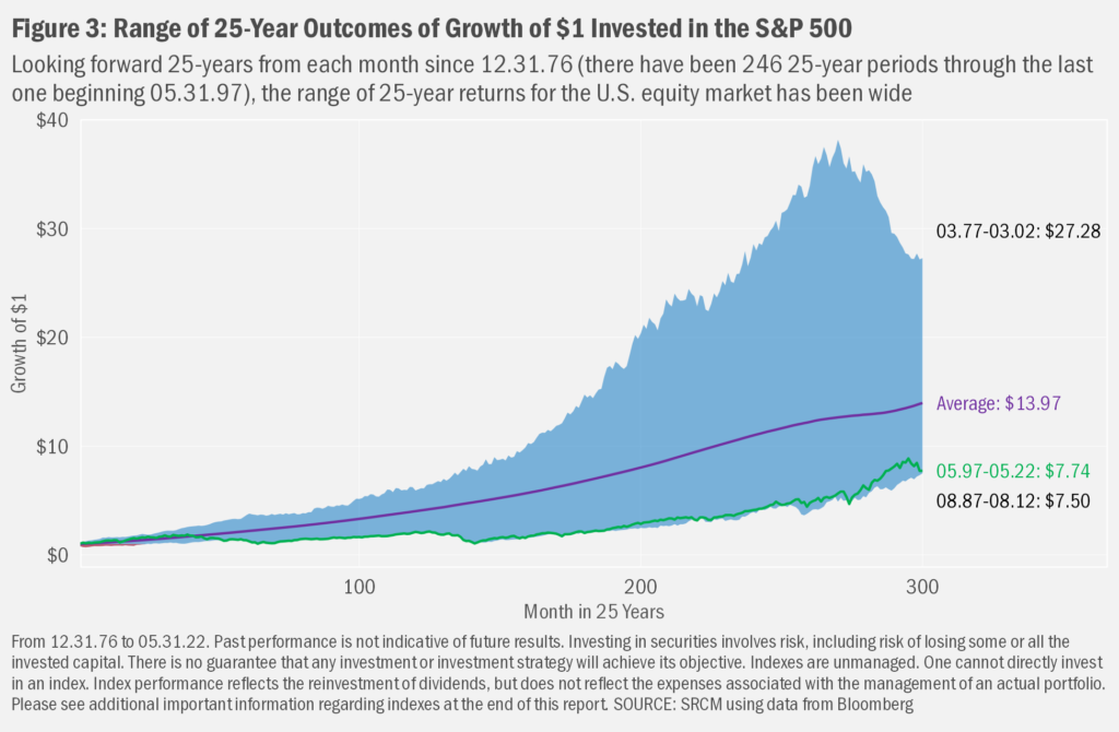
In Figure 3, we chart the paths of hypothetical 25-year investments in the S&P 500. Immediately obvious when we chop up returns this way is a wide spread of ending values. The best outcome seen was from March 1977 to March 2002, over which time an initial $1 invested turned (again...hypothetically) into more than $27. The least fortunate period lasted from August 1987 to August 2012, when the initial $1 grew to a relatively less substantial $7.50.
We can also look at those outcomes over time, as we show in Figure 4. Notable from this view is that one of the peakier values of close to $27, reflecting a 25-year period ended May 2007, arrived only 20 months before a result ended February 2009 over which $1 invest on February 1984 grew only to $8.75, ranking among the worst outcomes. While both periods “survived” the market crash of October 1987 and the Technology Bubble’s burst in 2001, the former ended at the market peak just prior to the Financial Crisis, while the latter finished at the very trough of the market during the Crisis. Also noteworthy is the observation that the series has proved much more stable since the mid-80s, albeit at much lower levels than seen prior fact. Noticeable, too, is the fact that the latest result is close to that minimum for the series.
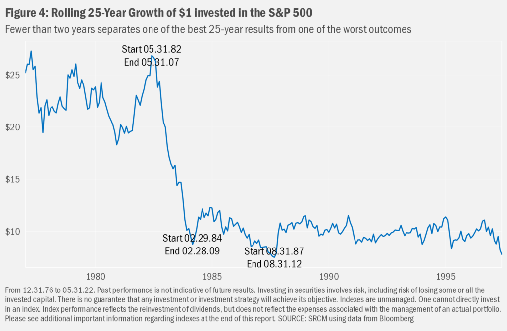
A bit shocking the difference a few months can make. And that’s the point of this exercise. Basing one’s estimations for the future on returns of the past may lead to unreasonable expectations unless one also properly includes in those expectations a range of potential outcomes. The better way to think about historical return—and therefore properly set expectations for potential future return—is not to pin our hopes on the average annualized gain across all those 25-year periods of 10.8%, but rather understand that the outcome might be something between 8.4% and 14.1%, with a bias toward the lower end to build in some level of higher confidence in our projections.
But the actual end result may end up well outside even the historical range. This is the nature of investment risk. While we as investors have rare control over most of the events that shape our investment time horizons, we should have some control over the actions that we take in advance of and in response to such events. We cannot choose when we are born or when we die. Nor can we choose how the market will evolve during our investment lifetimes. How we generate investable income is both up to us and is dependent on the universe in many ways. Nevertheless, we have some manner of ability to decide when we begin to invest. And we should have great control over how we invest. In turn, we may have some control over when we might begin to partake of any wealth we have accumulated. And we should, when desired, be able to control how we might like to pass on whatever is left of our investments to the next generation and other endeavors.
Long Life to Live
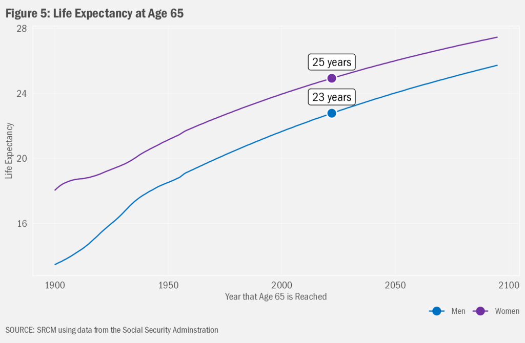
Which brings us to the decumulation phase of the investment time horizon. Not that the accumulation side is uncomplicated, we probably will need to put greater thought into strategies to avoid spending down those savings too quickly. Again, when accumulating invested monies for use later in life, we can think of our eventual result as being a series of multiplications: our initial funds multiplied by investment total return (price change plus reinvested income) over time. When we begin to spend more than we save, that multiplication still applies to the extent that we remain somehow invested, though we complicate the math by subtracting our net withdrawals. Our objective is to have our monies outlast our retirement. And that could be a long time. The Social Security Administration estimates that folks turning to a life of leisure at age 65 this year may have well more than 20 years of retirement to fund with income from savings and other sources. As life expectancy continues to lengthen, it’s become ever more paramount to have a plan to make savings and other sources of income last.
Adding in Subtraction
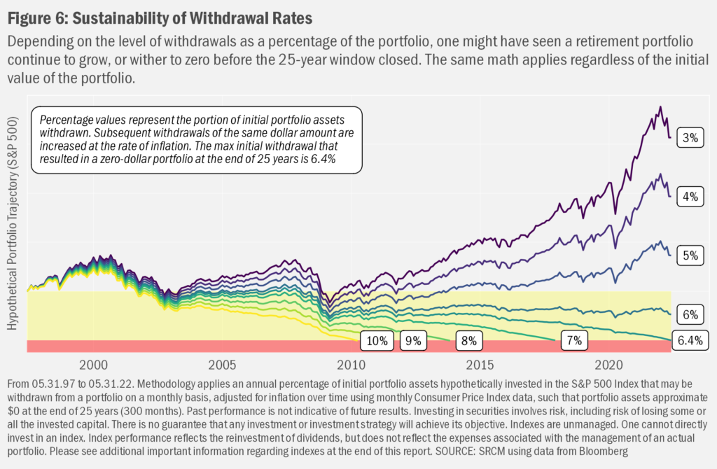
There are myriad ways to model the potential longevity of savings in retirement. Most involve establishing a periodic withdrawal rate from savings using either a fixed dollar amount (e.g., $1,000 per month) or a percentage-of-savings level (e.g., 3% of savings per year). Conversations about retirement tend to focus on the latter, as percentages can be applied generically to any portfolio, with the absolute dollar amount being whatever results from the math. The hypothetical data in Figure 6 show how a portfolio 100%-invested in U.S. stocks over the past 25 years would have seen the value of that portfolio evolve over time considering different rates of withdrawal. To bridge the gap between the two methods of thinking about withdrawals—percentage-based and dollar-based—the first step in the calculation assumes a specific percentage of the initial portfolio value (e.g., 5%) and then adjusts whatever was the dollar amount associated with that percentage (e.g., $5,000) for inflation over time. Not surprisingly, at lower initial withdrawal rates, the portfolio continues to grow; at higher levels, the portfolio falls to zero before the 25-year window closes.
Your Results Likely Will Vary
Starting with a monthly withdrawal that equates to 6.4% of the portfolio on an annual basis in the first month (May 1997) and increasing that monthly value over 25 years at the rate of inflation, the hypothetical retiree would have had just enough money to last the full 25 years (and not a month longer). We can call that level the hypothetical maximum sustainable initial withdrawal rate. Withdrawing less than that level resulted in hypothetical portfolios that survived the 25-year period. Withdrawals greater than 6.4% saw portfolios evaporate before the targeted 25 years.
The caveats to the story told in Figure 6 are many. First, the data shown only hypothetically would have applied to the last 25 years. That is, readers should not take from the data the idea that anyone should be able to take 6.4% from any portfolio year after year and never run out of money. Step back in time just one month (April 1997 through April 2022) and one finds a modestly different outcome was hypothetically possible: the maximum sustainable initial withdrawal rate was 6.8%. Back up a month before that and the value rises a bit further to 7.2%. The reasons for the changes are two-fold: both the monthly series of investment returns and the rates of inflation are different over all of the 246 25-year windows we can review since 1926.
The larger the differences in returns and inflation in the interim, the larger the differences in potential results. The upshot is that a wide range of outcomes are possible, with investment returns—particularly those early on in our spending years—seemingly more impactful. In Figure 7 we show the results of repeating that process of stepping back a month and running a new 25-year window all the way back to the 1926 start of the data we have for the S&P 500. In that chart we see that that the hypothetical maximum sustainable initial withdrawal rate ranged from 3.1% for the 25-year window began August 1929 to 17.4% for the 25-year window began June 1932.
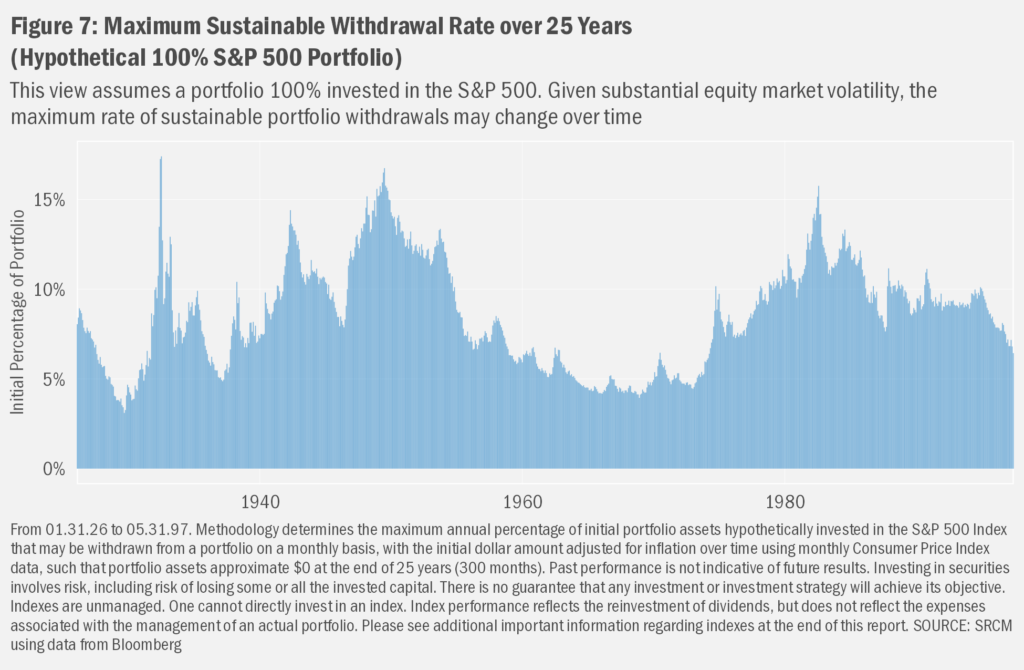
Lest one think that solely the Great Depression can lead to widely different potential levels of spending, the lowest maximum sustainable rate since 1949 was just 3.9% for the 25 years that began November 1968 and ended November 1998. Those three decades were marked by a sharp year-and-a-half decline through June 1970 of close to 30%, followed by a plunge in 1974 that left the equity index close to the 1970 lows. A hypothetical investor over those 25 years also lived through the market crash in 1987 (Black Monday), the Asian and Russian financial crises of 1997 and 1998, respectively, and variously severe declines and euphoric rebounds in between. At the other end of the spectrum, despite both the Technology Bust of 2000-01 and the Financial Crisis of 2008-09, the substantial gains through the 80s and 90s offered a hypothetical 15.8% maximum sustainable initial withdrawal rate from July 1982 through July 2007.
Incorporating Flexibility
These results may seem rather obvious: markets can bolster our savings but spend too much and one still can run out of money. For most, then, not running out of money in retirement will depend on knowing what levels of spending might be sustainable. We further like to remind folks that one should not rely on investment returns alone when seeking optimal retirement outcomes. Starting with the level of savings, we should save as much as possible as early as possible in our earlier years to take advantage of the power of compounding investment returns over time. We then may choose a manner of investing that seeks to balance a potential desire to maximize our investment returns with our tolerance for investment risk so that we might remain invested during periods of market stress.
Even more, we should regularly revisit our desired level of exposure to investment risk and expected investment return over time as our perspectives, financial situations and goals change. These intentions may become particularly critical as we begin to withdraw more from our investment accounts than we save. When in our decumulation phase, the balance between maintaining a desired lifestyle and the potential longevity of our savings becomes even more delicate.
For Better, For Worse
The data utilized so far in this commentary reflect hypothetical investment entirely in the U.S. equity market. Those results show wide variability in the range of potential rates of withdrawals from portfolios. This variability stems directly from the vast range of volatility and long-term return in the stock market that we have experienced in the past. Critical to the rather optimistic view of potential outcomes these analyses present is the ability of an investor to remain invested through the various bouts of market instability experienced over the past century. As we so often remark in our commentaries, such patience and calm should not be considered a given.
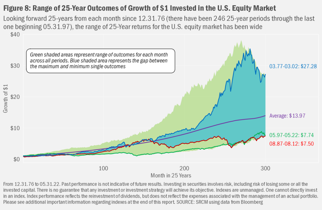
Revisiting Figure 3, and (apologetically) adding a bit more complexity, we can see again just how varied long-term outcomes have been over the past near century of market history. In Figure 8 we added green shading to the area that show the maximum and minimum interim results at each month. The bluish area is the difference between the best outcome (blue line) and the worst outcome (red line). Though the maximum-value hypothetical ending portfolio is many times more than that of the minimum, there were many points along the way at which that 25-year period had not seen the best returns compared to other 25-year periods (the blue line does not sit at the top of the green area). In fact, the 25-year outcome that ended up being the best (March 1977 through March 2002) had seen weaker interim returns than the eventual worst outcome (blue line fell below the red line).
Volatility Is Unavoidable
Even more, it’s not like that best outcome was smooth sailing. Looking at the tail end of the blue line in Figure 8, we can see the substantial decline in U.S. stocks that occurred during the Technology Meltdown of 2000-01. In fact, there isn’t a period in the dataset that had not seen one or several substantial declines in the equity market over its tenure. Seems every decade comes with a major downturn or two. In Figure 9, we take a longer look at U.S. market history, again using the S&P 500 Index as our guide. The chart overlays the maximum future sustainable withdrawal rate from
Figure 7 against the interim drawdowns (or declines from a prior peak before returning to that peak) in the U.S. market. Looking a bit deeper into the data, we find that drawdowns in the early years of the decumulation phase seem to have a particularly detrimental effect on the relative level of sustainable withdrawals. That seems intuitive: when we sell assets to raised funds for withdrawal, doing so during a drawdown “locks in” those losses. And declines in total funds available at the start create a weaker foundation for any longer-term growth in assets to offset required withdrawals, even before we consider the effects of inflation.
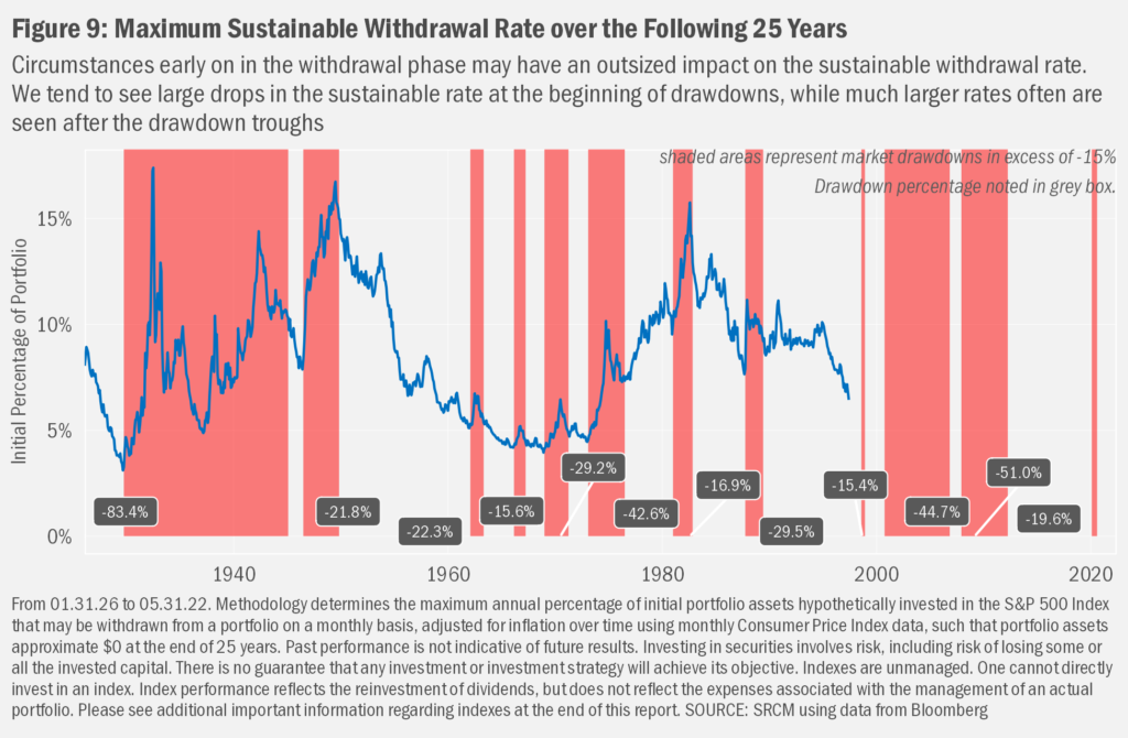
Drawdowns at any point during the decumulation phase are almost certain to cause concerns about the sustainability of withdrawals. There are many methods to prepare for, potentially moderate the effects of, and acknowledge the ongoing implications of market volatility in the context of our financial plans. As we discussed earlier, we can model existing plans against a range of market scenarios we have experienced in history to determine the defensibility of our assumptions regarding the longevity of our assets. And we can alter our exposure to market risk not only to match our investment preferences, but also to potentially foster greater surety with regard to our estimations. We further can choose how we react to the many ways that interim market activity affects the clarity and durability of our plans. For example, to the extent that we can temper spending during market declines (such as the one we presently are experiencing) we can partially avoid locking in losses while leaving more assets in the portfolio to potentially participate in any market rebound.
Confidence in Sustainability
When it comes to investing, the answer to “how much?” is heavily dependent, in our view, on the answers to “where are we now?” and “how do we expect to get where we want to be?” A response to the former is a matter of taking stock of our current savings. We can add to that value estimations for future savings. Answering the “how” part of the question, if we intend to invest those dollars, the return we expect from those investments is a critical determinant of the eventual expected value of our invested funds. As critical to achieving that eventual value is the risk that we take on with those investments. While the return can set the expectation of an eventual value, the risk of our investments tells us how likely we are to achieve that value over various periods of time, given the potential for riskier investments to deter folks from sticking to a predetermined investment plan.
Plotting the Path
In many cases, it is likely that individual tolerance for market risk will wane over time. Often due to age-induced pragmatism, we might like our portfolios to become less volatile as our desires for the security of our savings grows. A progression in portfolio exposures from higher to lower overall expected portfolio risk can be labelled a “glidepath.” This glidepath expresses the past and potential future mix of exposures in the portfolio in order to set expectations for relative potential risk and return.
But what might that progression look like from a risk and return standpoint? To answer that question, we have developed a hypothetical glidepath and charted the resulting hypothetical returns as demonstrative of the potential impacts of incorporating such a strategy[1]. Importantly, as we have shown so far in this commentary, such hypothetical reviews may not at all be indicative of the manner and scale of market returns we might see on a going-forward basis. They can, however, be useful in expressing some important investment concepts, which is how we will use them here.
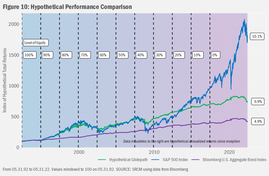
To create a hypothetical glidepath of portfolio exposures, we started by gathering the past nearly three decades of returns for the S&P 500 Index and the Bloomberg Barclays U.S. Aggregate Bond Index. These two indexes also will represent the equity and fixed income allocations, in that order, of our hypothetical portfolio. For this hypothetical portfolio, we assume a shift in weights between equity and fixed income since the beginning of the data until now. Starting with 100% equity in May 1992, we drop the equity weight of the hypothetical portfolio by 10% every 2.5 years (30 months) until we reach 100% fixed income in May 2017. Meantime, we track the overall performance of that hypothetical combination. The total return series of all three are detailed in Figure 10.
Perhaps the first detail of note regarding the relative performance is that the equity portfolio outpaced the hypothetical glidepath portfolio, which outpaced the fixed income portfolio. From what we already have discussed this result should have been expected. However, also obvious is that the equity portfolio was not always ahead of the others. Greatly exceeding the performance of the hypothetical glidepath and bond portfolios through the turn of the millennium, the bursting of the bubble in technology stocks in 2000-01 lead to strong downturns in both the equity and the hypothetical glidepath portfolio, though the lower exposure to equity in the latter led to relative outperformance as the bubble burst. The same pattern occurred during the Great Financial Crisis of 2007-08, this time leading the 100% equity portfolio to underperform fixed income all the way back to the beginning of the study. Since then, however, equities have gone on to recover all those relative losses and much more. This despite the downturns at the end of 2018, during the early part of the COVID-19 market crisis and the present market drawdown. Meantime, the performance of the hypothetical glidepath portfolio participated less in that recovery as the overall allocation to equity declined. Nonetheless, the overall long-term result was substantially better than the 100% exposure to fixed income.
Turned Down Vol
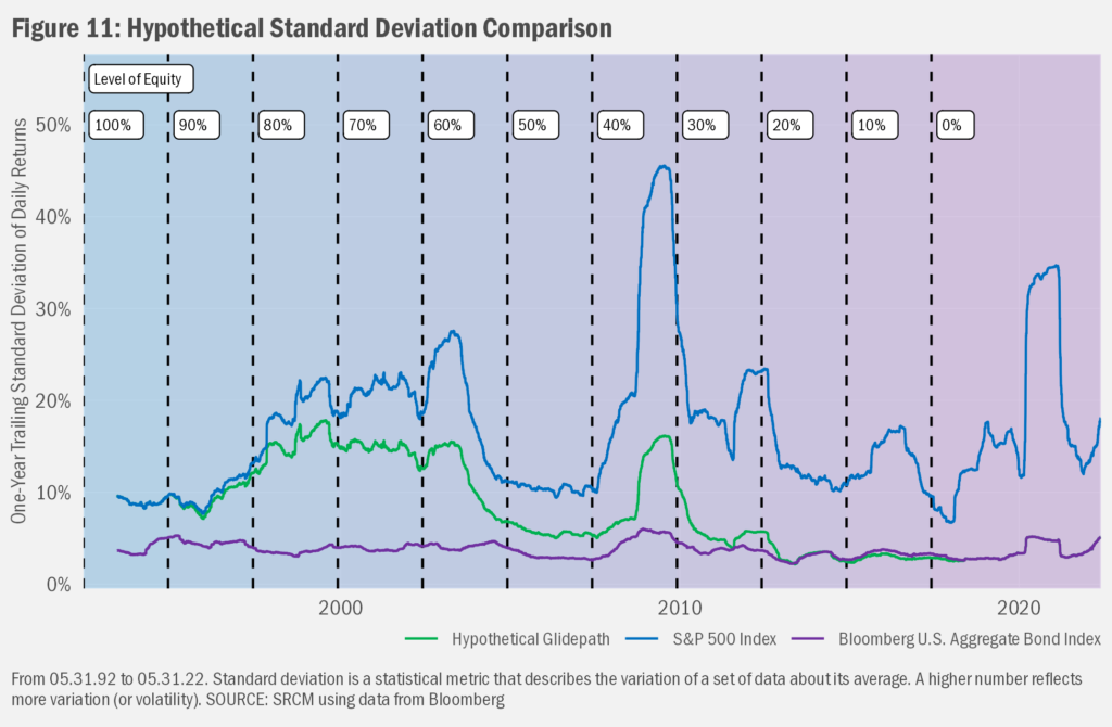
Volatility is the subtext of that high-level long-term performance review. While the hypothetical performance chart suggests a higher level of volatility in those allocations with more equity, there’s a way to see those differences more clearly. In Figure 11, we present trailing[2] 1-year standard deviation data. Obvious is the always higher level of volatility of the equity portfolio, versus the fixed income portfolio. Over time, the volatility of the hypothetical glidepath portfolio shifted from equaling that of the equity portfolio to matching that of the fixed income portfolio.
Persistence is Key
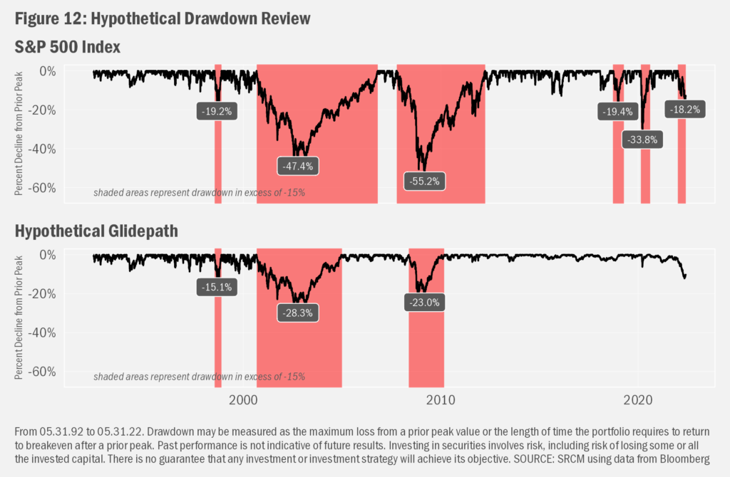
Even with the extra volatility, the long-term returns of the equity portfolio—with perfect hindsight, at least—likely present an attractive scenario for some. Turning back to one of the challenges of hypothetical scenarios, we must consider one’s ability to stick with a particular investment strategy through thick and thin. To have seen anything like those long-term returns, one must have remained invested through each of the four major declines in the S&P 500 greater than 20% experienced over the past several decades. For certain individuals, such losses may have proved too much to bear; they may have exited the market on the way down or at the bottom and may not have participated in the eventual recovery. In Figure 12, we compare the drawdowns for the S&P 500 to our hypothetical glidepath portfolio. Noting again that the past is not predictive of future performance, the relatively lighter (though still substantial in most cases) drawdowns of the hypothetical glidepath portfolio demonstrate the potential volatility-dampening characteristics of fixed income allocations.
Your Personal Glidepath
While we cannot foresee what shall become of the market over the longer-term future, we can plan to be adaptable to circumstances in the interim. In particular as we begin to withdraw more than we save in our investment portfolios, we may need to balance the longevity of our savings against levels of spending. We also may want to de-risk portfolios through time as sensitivity to market volatility rises.
Indeed, there’s one more very important layer of complication that we can add to the mix. And that’s the notion that the sustainable rate of withdrawals is likely to be lower were one to pursue a longer-term risk-reduction strategy that’s exemplified in this hypothetical glidepath. The max-withdrawal reviews presented earlier depended on the higher historical returns of the U.S. equity market. Adding fixed income to the mix generally will lower the expected return of the portfolio while also lowering the expected risk. That trade-off may or may not be necessary or desired, given each client’s unique financial situation.
And it’s in managing this balance that we think an advisor can be truly helpful for clients hypothesizing retirement. An advisor can help clients establish and implement plans that take into consideration such details, assist in digesting new information, and alter existing plans where necessary with the goal that the client ultimately may be more successful in their pursuits of financial goals.
Important Information
Signature Resources Capital Management, LLC (SRCM) is a Registered Investment Advisor. Registration of an investment adviser does not imply any specific level of skill or training. The information contained herein has been prepared solely for informational purposes. It is not intended as and should not be used to provide investment advice and is not an offer to buy or sell any security or to participate in any trading strategy. Any decision to utilize the services described herein should be made after reviewing such definitive investment management agreement and SRCM’s Form ADV Part 2A and 2Bs and conducting such due diligence as the client deems necessary and consulting the client’s own legal, accounting and tax advisors in order to make an independent determination of the suitability and consequences of SRCM services. Any portfolio with SRCM involves significant risk, including a complete loss of capital. The applicable definitive investment management agreement and Form ADV Part 2 contains a more thorough discussion of risk and conflict, which should be carefully reviewed prior to making any investment decision. All data presented herein is unaudited, subject to revision by SRCM, and is provided solely as a guide to current expectations.
The opinions expressed herein are those of SRCM as of the date of writing and are subject to change. The material is based on SRCM proprietary research and analysis of global markets and investing. The information and/or analysis contained in this material have been compiled, or arrived at, from sources believed to be reliable; however, SRCM does not make any representation as to their accuracy or completeness and does not accept liability for any loss arising from the use hereof. Some internally generated information may be considered theoretical in nature and is subject to inherent limitations associated thereby. Any market exposures referenced may or may not be represented in portfolios of clients of SRCM or its affiliates, and do not represent all securities purchased, sold or recommended for client accounts. The reader should not assume that any investments in market exposures identified or described were or will be profitable. The information in this material may contain projections or other forward-looking statements regarding future events, targets or expectations, and are current as of the date indicated. There is no assurance that such events or targets will be achieved. Thus, potential outcomes may be significantly different. This material is not intended as and should not be used to provide investment advice and is not an offer to sell a security or a solicitation or an offer, or a recommendation, to buy a security. Investors should consult with an advisor to determine the appropriate investment vehicle.
The S&P 500 Index measures the performance of the large-cap segment of the U.S. equity market.
The Bloomberg U.S. Aggregate Bond Index is a broad-based flagship benchmark that measures the investment grade, U.S. dollar-denominated, fixed-rate taxable bond market. The index includes Treasuries, government-related and corporate securities, MBS (agency fixed-rate pass-throughs), ABS and CMBS (agency and non-agency).
One cannot invest directly in an index. Index performance does not reflect the expenses associated with the management of an actual portfolio.
Investing in any investment vehicle carries risk, including the possible loss of principal, and there can be no assurance that any investment strategy will provide positive performance over a period of time. The asset classes and/or investment strategies described in this publication may not be suitable for all investors. Investment decisions should be made based on the investor's specific financial needs and objectives, goals, time horizon, tax liability and risk tolerance.
[1] First, though, some warnings regarding hypothetical returns: This backtested performance review involves simulation of a quantitative investment allocation by applying investment rules to a set of indexes during a specific market period and measuring the changes in value of the hypothetical investment based on the actual prices of the indexes during the period covered. Hypothetical allocations are based on a static allocation to indexes and allocations are rebalanced at each quarter end. The results are entirely hypothetical in nature and should not be relied upon as a source of probable or possible investment return or risk scenarios. No risk or return profile can be guaranteed. Backtested performance does not represent actual account performance and should not be interpreted as such. Backtested performance does not reflect the impact that material economic and market factors might have had on the investment decision-making process if SRCM were managing actual assets. The period reviewed may not be indicative of the results one might have expected were a different period chosen for the study.
[2] A rolling period is a window of time of a specific length with an underlying periodicity. An example would be 10 years using monthly periods (meaning there are 120 months in each rolling 10-year period). Importantly, rolling periods overlap. For a 10-year monthly series, we start with the first 120 months to take a measurement. We then drop the first month (month 1) and include the month after the last month in the prior series (month 121) along with each month in between. This process goes on until we arrive at the final 120 months in the series. Since we are looking at the data from the end of each rolling 10-year period, we refer to the data as a trailing series.

